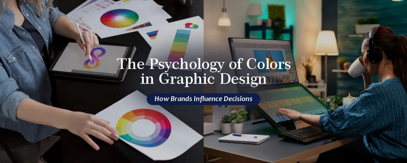
Introduction
Have you ever noticed how a simple color can make you feel hungry, calm, or even excited? That’s not an accident—it’s psychology at work. In the world of branding and marketing, colors are far more than decoration. They trigger emotions, shape perceptions, and influence decisions.
For graphic designers, marketers, and business owners, understanding the psychology of colors in graphic design is essential. A well-chosen color palette can create instant recognition, build trust, and even drive sales. On the other hand, poor color choices can confuse audiences and weaken your brand message.
In this blog, we’ll explore the importance of color in graphic design, the emotional impact of colors, real-world branding examples, and 2025 design trends that businesses should know.
Why Colors Matter: The Importance of Color in Graphic Design
Colors do more than make your design look attractive. They act as a silent communicator, telling people what your brand stands for before they read a single word.
- First impressions happen fast. Research shows people form opinions about products within 90 seconds—and up to 90% of that judgment is based on color.
- Colors build identity. Think of Coca-Cola’s iconic red. Even without the logo, that shade instantly screams “Coke.”
- Colors influence behavior. Studies reveal that certain colors encourage actions like buying, subscribing, or clicking.
This is why color psychology in branding isn’t just a creative decision—it’s a strategic one.
The Emotional Impact of Colors
Different colors spark different feelings. Let’s break down the emotional impact of colors and how brands use them:
Red – Energy, Passion, Urgency
Red grabs attention like no other. It’s associated with excitement, urgency, and even appetite.
- Examples: Coca-Cola uses red to create energy and passion. Netflix uses red to suggest excitement and entertainment.
Blue – Trust, Calm, Professionalism
Blue is the most universally liked color. It signals trust, security, and reliability.
- Examples: Facebook’s blue fosters connection and trust. LinkedIn’s blue communicates professionalism.
Yellow – Optimism, Warmth, Attention
Yellow sparks happiness and friendliness. But too much can feel overwhelming.
- Examples: McDonald’s uses yellow arches to attract hungry, happy customers. IKEA uses yellow for friendliness and accessibility.
Green – Growth, Nature, Health
Green is linked with freshness, balance, and eco-friendliness.
- Examples: Starbucks uses green to represent calmness and growth. Whole Foods leans into green to highlight health and natural living.
Black – Luxury, Power, Elegance
Black is bold and sophisticated. It suggests exclusivity and authority.
- Examples: Chanel and Apple often use black to signal premium quality.
White – Simplicity, Purity, Minimalism
White feels clean, fresh, and modern. It’s widely used in tech and lifestyle brands.
- Examples: Apple’s white spaces highlight simplicity and innovation.
Understanding these associations helps designers apply the psychology of colors in graphic design more effectively.
Color Psychology in Branding: Turning Emotions into Strategy
Knowing what colors mean is one thing, but applying them strategically is where the magic happens.
- Brand Positioning – A financial service may use blue to communicate trust, while a fast-food brand may prefer red to drive urgency.
- Target Audience – Younger audiences often prefer bold, vibrant palettes, while older demographics may respond better to muted tones.
- Cultural Context – Colors mean different things in different regions. For example, white symbolizes purity in Western cultures but mourning in some Asian traditions.
That’s why color psychology in branding is never one-size-fits-all. It must align with the brand’s vision, audience, and cultural context.
Case Studies: How Brands Use the Psychology of Colors
Coca-Cola: Red for Energy
Coca-Cola has consistently used red for decades to symbolize excitement, passion, and joy. Their campaigns often tie into celebrations, reinforcing the color’s emotional pull.
Facebook: Blue for Trust
Mark Zuckerberg chose blue partly because he is red-green colorblind. But beyond that, blue communicates safety and trust—exactly what a social network needs to encourage sharing.
McDonald’s: Yellow for Happiness
McDonald’s iconic yellow arches aren’t just about visibility. Yellow makes people feel cheerful and hungry, perfectly aligning with their “happy meal” experience.
Apple: White and Minimalism
Apple built its empire on sleek, white minimalism. Their branding makes technology feel simple, approachable, and futuristic.
These examples show how the importance of color in graphic design goes beyond looks—it’s about creating emotions that drive customer decisions.
2025 Design Trends: Color Psychology in Action
The way colors are used in branding evolves with consumer behavior. Here’s how businesses are applying color psychology today:
- Bold Gradients – Brands are moving from flat colors to vibrant gradients (Instagram’s logo is a great example) to capture attention in crowded digital spaces.
- Eco-Inspired Palettes – With sustainability being a top concern, greens, earthy browns, and muted blues are gaining popularity in 2025.
- Digital Minimalism – Many brands use simple, calming colors to create a distraction-free experience in a noisy online world.
- Custom Brand Shades – Instead of generic colors, companies are creating unique shades (like Tiffany Blue) to stand out and own an emotional space.
For graphic designers, these trends highlight the need to balance timeless psychology with modern innovation.
How Businesses Can Apply Color Psychology
If you’re a small business owner or marketer, here are simple steps to apply color psychology in branding:
- Define your brand’s personality (serious, playful, luxurious, eco-friendly?).
- Understand your audience’s preferences and cultural context.
- Choose a color palette that communicates your values.
- Test your colors across platforms (digital, print, packaging).
- Stay consistent—brand recognition grows when colors remain the same.
Colors should be chosen not just because they look “nice,” but because they tell your brand’s story.
Arrowpace: Turning Color Psychology into Powerful Branding
Understanding the psychology of colors in graphic design is one thing. Applying it to create a brand that truly influences decisions is another.
If you want your brand colors to not just look good but also connect emotionally with your audience, Arrowpace’s Graphic Design Services can help. Our team blends design expertise with color psychology to craft visuals that inspire trust, trigger emotions, and drive conversions.
From logo design to full brand identity systems, Arrowpace ensures that your brand colors don’t just decorate—they communicate.
Conclusion: Make Colors Work for Your Brand
Colors are powerful tools. They influence emotions, shape brand perceptions, and impact customer decisions. Whether it’s Coca-Cola’s energetic red, Facebook’s trustworthy blue, or Apple’s minimal white, the importance of color in graphic design is undeniable.
As a business owner, marketer, or designer, your color choices can be the difference between blending in and standing out. Start by understanding the emotional impact of colors, then align them with your audience and brand message.
And if you want expert guidance, Arrowpace’s Graphic Design Services are here to help you turn color psychology into a competitive advantage.
Practical takeaway: Next time you choose a brand color, don’t just ask, “Does it look good?” Ask, “What does it make people feel?”